Brand Identity Systems
I create cohesive brand identity systems that establish a consistent visual language across digital, print, and marketing applications. From logos and typography to color palettes, brand guidelines, and supporting graphics, each system is designed to strengthen recognition while remaining flexible enough to work across a wide range of media.
Brand Overview
A strong brand begins with a clear understanding of who you are, what you offer, and how you want to be perceived. Defining the brand’s purpose, audience, personality, and values creates a foundation for every visual and communication decision that follows.
Logo System
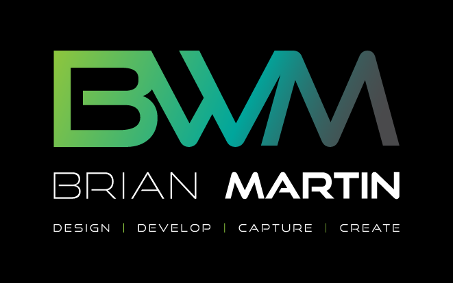
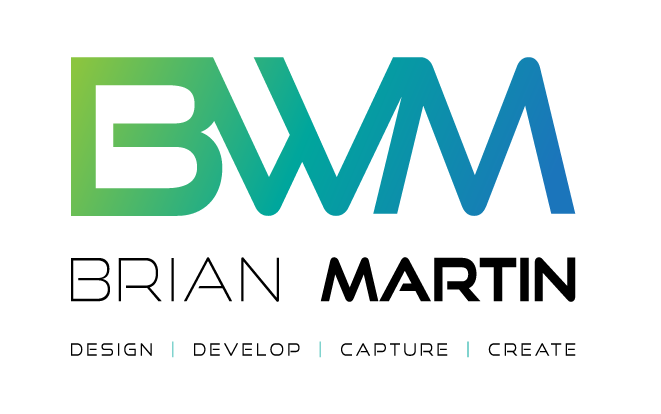
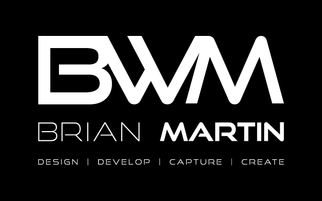
Your logo is often the most recognizable element of your brand, but a single logo rarely works equally well in every situation. A complete logo system includes primary, secondary, simplified, reversed, and monochrome versions so the identity remains recognizable and consistent across websites, social media, print, signage, and other applications.
Logo Usage & Clear Space
Consistency helps build recognition. Establishing rules for logo spacing, minimum sizes, backgrounds, colors, and placement prevents the identity from becoming distorted or visually inconsistent as it is used by different people and across different media.
Color on Black
Color on White
White on Black
Black on White
Color Palette
Color can become one of the fastest ways customers recognize a business. A defined palette establishes primary, secondary, and accent colors along with precise HEX, RGB, CMYK, and Pantone values when appropriate. These standards help maintain consistent color across screens, printed materials, advertising, and other brand applications.
Teal
HEX: #00A79D
RGB: 0, 167, 157
CMYK: 100, 0, 6, 35
Dark Green
HEX: #009444
RGB: 0, 148, 68
CMYK: 100, 0, 54, 42
Light Green
HEX: #8dc63f
RGB: 141, 198, 63
CMYK: 29, 0, 68, 22
Black
HEX: #000000
RGB: 0, 0, 0
CMYK: 0, 0, 0, 100
Charcoal
HEX: #414042
RGB: 65, 64, 66
CMYK: 2, 3, 0, 74
Dark Grey
HEX: #6d6e71
RGB: 109, 110, 113
CMYK: 4, 3, 0, 56
Medium Grey
HEX: #939598
RGB: 147, 149, 152
CMYK: 3, 2, 0, 40
Light Grey
HEX: #dcddde
RGB: 220, 221, 222
CMYK: 1, 0, 0, 13
typography
Typography plays a major role in both personality and readability. Establishing typefaces and a clear hierarchy for headings, subheadings, body copy, captions, buttons, and other text creates consistency while helping customers quickly understand the organization and importance of information.
An H1 is the primary heading of a webpage and should clearly communicate the page’s main topic or purpose. In most cases, each page should have one prominent H1 that describes its overall content, such as “Brand Identity Systems,” “Web Design,” or “Contact.” A clear H1 establishes the page’s visual and semantic hierarchy, helps visitors quickly understand where they are, and gives search engines and assistive technologies important context about the page’s content.
An H2 is used for the major sections within a webpage, organizing content beneath the primary H1. H2 headings help break a page into clear, scannable topics and establish a logical content hierarchy. For example, on a Brand Identity page with an H1 of “Brand Identity System,” H2 headings might include “Typography,” “Color Palette,” “Logo Usage,” and “Iconography.” Consistent H2 usage improves readability, accessibility, and helps search engines understand how the page’s content is structured.
An H3 is used for subsections within an H2 section, adding another level of organization when a topic needs to be divided into more specific categories. For example, under an H2 of “Typography,” H3 headings might identify “Primary Typeface,” “Secondary Typeface,” or individual heading styles. H3s help maintain a clear hierarchy, making detailed content easier to scan and understand without competing visually with the page’s primary and secondary headings.
An H4 is used to organize content within an H3 subsection, providing an additional level of detail when needed. H4 headings are useful for labeling specific elements, examples, variations, or supporting information within a larger topic. They should be used as part of a logical heading hierarchy rather than simply for their visual appearance, helping keep complex content organized, accessible, and easy to navigate.
Iconography
Icons communicate information quickly and can reinforce a brand's visual personality without relying entirely on words. Defining a consistent approach to icon shape, weight, color, proportion, and style prevents a collection of unrelated graphics from making the brand feel fragmented.
Graphic Elements
A brand should be recognizable even when its logo isn't the dominant element. Supporting graphics such as shapes, lines, patterns, gradients, textures, and other visual motifs create a distinctive design language that can connect everything from a website to advertising and printed materials.
Photography & Imagery
Photography has an enormous influence on how a brand feels. Establishing guidelines for subject matter, lighting, composition, cropping, color treatment, and overall mood helps ensure that imagery supports the same personality and message across websites, social media, advertising, and marketing materials.
Layout & Composition
Consistent layouts make communications easier to recognize and easier to understand. Guidelines for spacing, alignment, grids, margins, image placement, and whitespace provide enough structure to create consistency while still allowing designers flexibility across different formats.
Digital & UI Elements
A brand's digital identity extends beyond its logo and colors. Buttons, navigation, forms, cards, links, hover states, borders, and other interface elements should all feel like parts of the same visual system. Consistency also makes websites and applications easier and more intuitive to use.
Voice & Tone
How a business speaks is just as important as how it looks. Defining a consistent voice helps ensure that website copy, advertising, social posts, emails, and customer communications all sound like they come from the same organization and reinforce the personality customers associate with the brand.
Accessibility
Good design should work for as many people as possible. Thoughtful decisions about color contrast, typography, sizing, hierarchy, interaction states, and alternative content improve usability for people with different abilities while often making the experience clearer for everyone.
Brand Consistency
The purpose of a brand identity system isn't to make every piece of communication look identical. It's to establish enough consistency that customers recognize the business wherever they encounter it. Clear standards give employees, designers, vendors, and partners a shared foundation while still leaving room for creativity and growth.